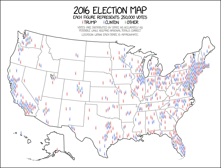
If you happen to be a fan of data-driven political analysis, you are probably also well aware of the ongoing challenge of how to effectively and accurately visualize maps that show US voting patterns. The debate over how to do this has been going on for decades but was nicely summarized in a 2016 article by the NYTImes Upshot section (https://www.nytimes.com/interactive/2016/11/01/upshot/many-ways-to-map-election-results.html).
Recently, Randall Munroe of XKCD fame came up with a version that is really nicely done version:

I was alerted to it by high praise for the approach from Vox:
https://www.vox.com/policy-and-politics/2018/1/8/16865532/2016-presidential-election-map-xkcd
Of particular note to me was that a cartoonist (albeit one with a strong science background) was the person who found the elegant solution to the density/population tradeoff issue across the US while also capturing the important mixing aspects (blue and red voters in every state). That isn’t meant as a knock on the professional political and data scientists who hadn’t come with this approach, but more of a note on how hard data visualization really is and how the best, creative, effective solutions might therefore come from surprising sources.https://xkcd.com/1939/